Jason Markk
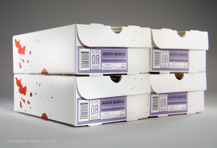
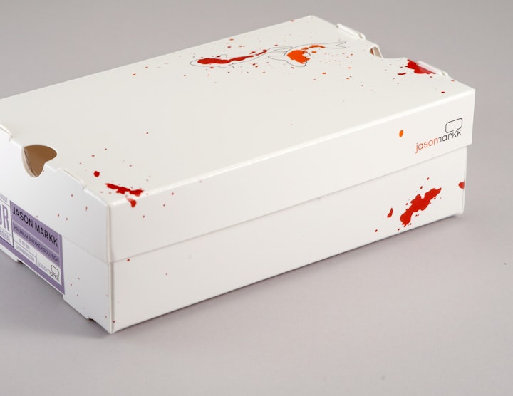
This Koi package for the Jason Mark Premium Sneaker Solution was the product that launched the Jason Markk brand. It filled the need of sneakerheads everywhere who sought a great cleaning a product for their shoes. It was released to a great deal of hype from industry trend setters and sneaker collectors and also garnishing real estate in magazines like Sneaker Freaker, Monocle, Complex, GLamour, Vibe and GQ.
It made perfect sense that a high end boutique sneaker cleaning kit be packaged in what else, a mini shoe box. The client came up with the structure and theme and we were tasked with making it feel fresh and relevant to the target audience. I created the paint splatter illustration which loosely made the koi shapes inspired by street art. The label, designed by Chhun Tang, was inspired by what would be usually found on a shoe box.
________
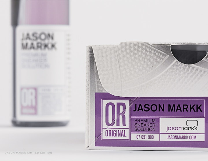
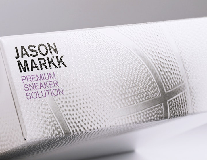
The second package that was done for the Jason Markk Premium Sneaker cleaner was targeted for a different, more mainstream audience. Because the sneaker culture evolved from the basketball scene, the graphics were inspired by the idea of what a ball with paint would look like when bounced on the floor. This 4oz. kit is smaller than the original 8oz. Koi box but maintains the same miniature shoe box structure.
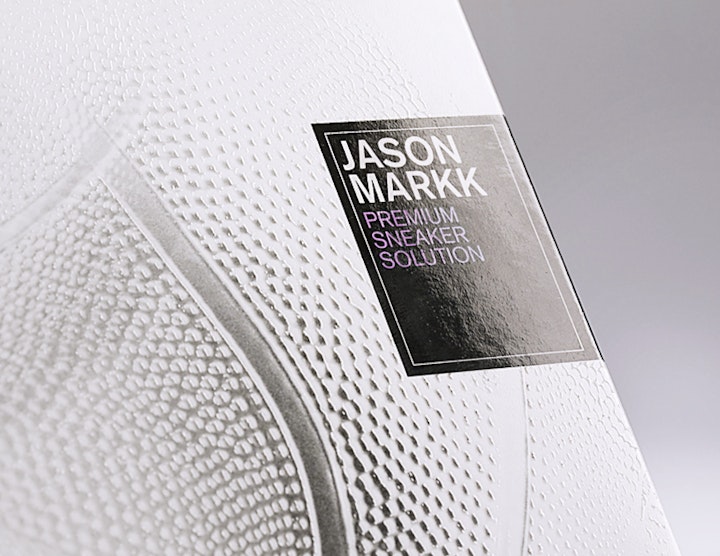
Printed in spot PMS colors using black, metallic purple and silver. A gloss spot varnish over the type and graphic elements were applied and then a textured UV was used for the areas of the ball. The illustration and label design were my design, print production was overseen by Chhun Tang